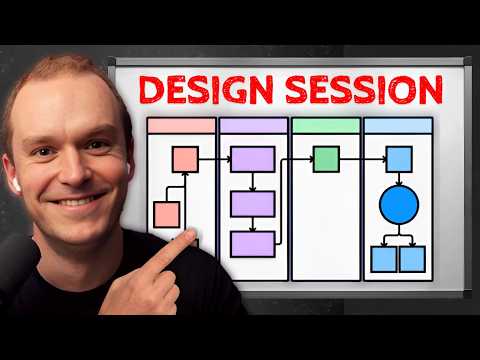
In this episode, I am joined by Michael Riddering, Creator of the Dive Club, where we dive deep into Figma and design. Learn the best practices to level up your process for designing apps
00:00 Intro
00:53 Designing a Landing Page
02:31 Creating Components for Efficiency
04:02 Adding Content and Typography
04:57 Finding Inspiration for Design
07:25 The Importance of Collecting Design Ideas
09:44 Iterating on Design Ideas
12:37 Best Practices for Front-End Design
17:21 Enhancing Visual Interest
29:10 Using Plugins for Design Efficiency
32:55 Inner shadows for the win
35:21 Figma vs. v0
1) Start with components ASAP
• Even before adding content, turn your frame into a component. It’s not just for design systems – it’s a speed hack!
• Components = one knob to rule them all. Changes propagate everywhere.
2) Inspiration is constant
• Don’t start from scratch. Build a notion database of design inspo.
• "I never turn it off basically… I’m constantly, constantly, constantly dumping things in there and categorizing them."
3) Auto layout is your best friend
• It maps to Flexbox in CSS. Makes responsive design a breeze.
• Pro tip: Use Shift+A to turn any frame into an auto layout.
4) Think in multiples of 8
• Stick to 8px increments for spacing. It aligns with Tailwind’s system.
• "When in doubt, you want something that’s a multiple of eight."
5) Add depth with blur & blend modes
Quick visual interest hack:
1. Add colored rectangle
2. Apply layer blur (20-30px)
3. Reduce opacity (2-4%)
4. Set blend mode to "luminosity"
Instant depth!
6) Noise = texture
• Use the "Noise and Texture" plugin for a subtle grain effect.
• Set opacity SUPER low (0.5-1%). It’s barely visible, but adds richness.
7) Prototype early & often
• Don’t wait to add interactivity. Use variants for hover states.
• Smart animate + "Gentle" easing = smooth transitions.
8) Shadows are tricky. Use plugins.
• The "Smooth Shadow" plugin is your friend. Multi-layer shadows made easy.
9) Inner shadows for the win
Create depth with inner shadows:
• Add white inner shadow at top (2-8px)
• Add dark inner shadow at bottom (-2 to -12px)
Subtle 3D effect!
10) Figma vs. v0 vs. Framer
• Figma: Rapid ideation, divergent exploration
• v0: Quick prototypes, slightly templated
• Framer: Final 5-10%, closer to production
Mix & match for best results!
Want more free ideas? I collect the best ideas from the pod and give them to you for free in a database. Most of them cost $0 to start (my fav)
Get access: https://www.gregisenberg.com/30startupideas
LCA helps Fortune 500s and fast-growing startups build their future – from Warner Music to Fortnite to Dropbox. We turn ‘what if’ into reality with AI, apps, and next-gen products https://latecheckout.agency/
BoringAds — ads agency that will build you profitable ad campaigns http://boringads.com/
BoringMarketing — SEO agency and tools to get your organic customers http://boringmarketing.com/
Startup Empire – a membership for builders who want to build cash-flowing businesses https://www.startupempire.co
FIND ME ON SOCIAL
X/Twitter: https://twitter.com/gregisenberg
Instagram: https://instagram.com/gregisenberg/
LinkedIn: https://www.linkedin.com/in/gisenberg/
FIND RIDD ON SOCIAL
Dive Club: https://www.dive.club
X/Twitter: https://x.com/ridd_design
LinkedIn: https://www.linkedin.com/in/michaelriddering/
Youtube: https://www.youtube.com/@joindiveclub


